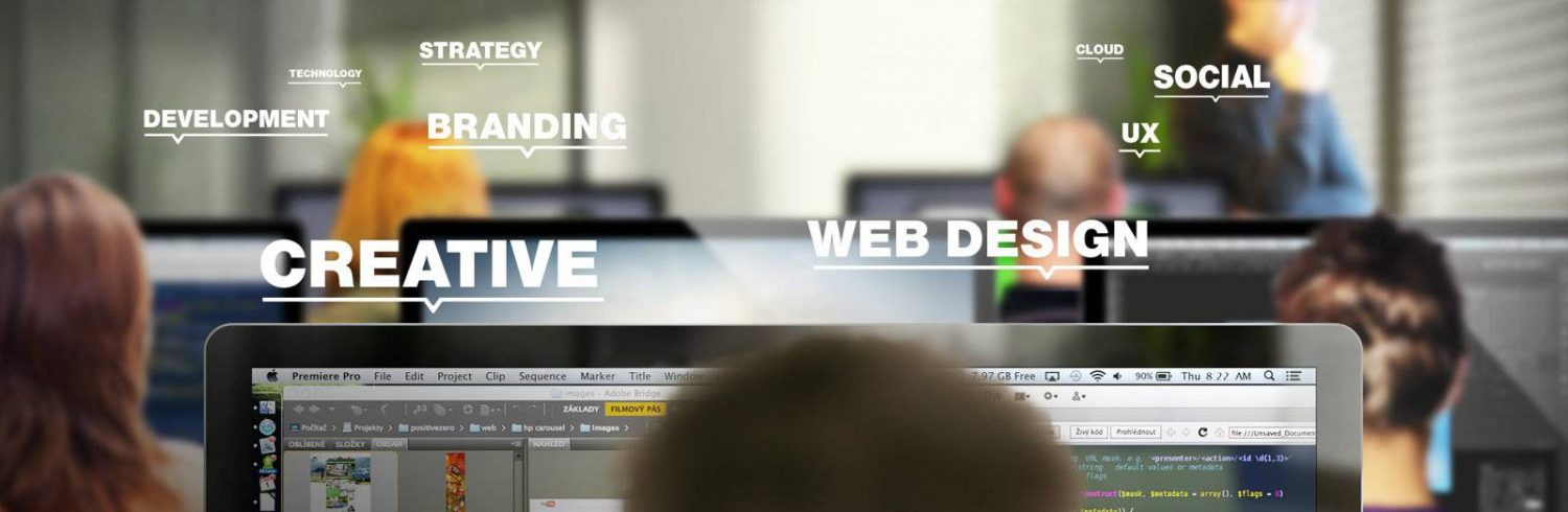
Where Does Your Business Website Rank On Our Web Design Essentials Scorecard
February 19, 2023

You will find that many skilled and creative professionals prefer to use checklists for each project they embark upon, and that will be the case for many web designers. Given that the creation of a website has several elements that all need to combine and function properly, a checklist is an ideal way to ensure each one is present and optimised.
For business owners who have a website, those same web design checklists can be useful, either to evaluate any new website that has been designed for them or to properly assess their current website to ascertain whether or not it needs to be redesigned. As such, we have outlined a simple web design checklist below which includes 25 desirable web design elements. With a point for each one, how many out of 25 does your business website score?
Website Structure & Navigation
- Consistent Pages: All pages should have a logo, header, and footer visible.
- Limited Levels: Do not have so many levels on your website that it feels like an endless maze.
- Search Function: Help your visitors find what they need by having a search box.
- Current Location: Let users know where they are using features like breadcrumbs.
- Simple Menus: Your menus and subsequent navigation should be easy for all.
Home Page
- Instant Recognition: Visitors should be able to identify what your website is about within 5 seconds.
- Strong Visuals: There should be a large image, video, or animation front and centre.
- Sparking Emotions: Ensure your home page invokes emotions that ensure the visitor stays.
- Call To Action: Your home page should have at least one call to action.
- Obvious Next Step: Anyone landing on your home page must see exactly what page they are to go to next.
Visual Appeal
- Quality Images: Use only professional images, especially photos, throughout your website.
- Logo Aligned Top Left: Convention states that logos should appear in the top left corner of each page.
- Image Sizes Optimised: Wherever possible, reduce image resolution and size to speed up load times.
- Consistent Icon Styles: If using icons, ensure they look as though they are part of a set.
- Eliminate Flash Animations: These are old technology without support.
- No Auto Play Videos: Make all videos click to play unless you want to annoy visitors.
Fonts & Texts
- Font Families: Remain consistent by only using a maximum of two font families.
- Font Size: For easier reading of the text, make font sizes at least 14 pt.
- Headline (H) Text: Best practice is to use no more than three different H text sizes.
- In-Line Hyperlink Text: Follow conventions and make in-line text links BLUE so that they can be easily identified by users.
- Avoid Long Scrolls: For larger sections of text, use the “Show More” and “Show Less” functions to avoid the need for constant scrolling.
User Experience (UX)
- Buttons And Links: Ensure that these are distinguishable, and visitors know exactly what every click is going to result in.
- User-Friendly Forms: If you wish visitors to fill in one or more forms, ensure form boxes, drop-downs, buttons, and fields are arranged correctly.
- Pop-Ups: Avoid using annoying, random pop-ups. If pop-ups are necessary, ensure they are unobtrusive and expected by the user.
- Interactive Content: if using interactive content that requires input from users, make it simple and provide clear instructions.


